
Convert a Website to a Mobile App Without Rejection
How to convert a website to a mobile app and pass App Store review, instead of getting rejected under Apple Guideline 4.2 for minimum functionality.
You can turn a website into a mobile app in an afternoon. The hard part is the next morning, when Apple rejects it. The email cites Guideline 4.2, Minimum Functionality, and you are left guessing what you did wrong. This post is the full path: how the conversion works, the exact native features that satisfy reviewers, how to handle in-app purchases so payments are not a hard rejection, and the layout changes that stop your app from reading as a website in a shell.
The thing that gets rejected is the thing most people build
The naive version of "website to app" is a native shell that opens a WebView pointed at your URL, and nothing else. It runs. It loads your site. It looks like an app in the simulator. Then it hits review.
Apple's Guideline 4.2 reads: your app should include features, content, and UI that elevate it beyond a repackaged website. Guideline 4.2.2 goes further, calling out apps that are primarily web clippings, content aggregators, or a collection of links. The reasoning reviewers give is consistent: if a user can do the exact same thing by typing your URL into Safari, there is no reason for the app to exist.
This is not a framework problem. Apple does not reject you for using a WebView, and they do not care whether you used Swift, React Native, or anything else. They reject the experience. An app that is a browser pointed at one site, with no native navigation, no push, no offline handling, and no device features, reads as a bookmark with an icon. That is the app that gets the 4.2 email, sometimes after the tenth resubmission with no new explanation.
Google Play is more permissive at submission but enforces the same idea through its minimum functionality and spam policies. The bar that passes Apple comfortably clears Play.
How the conversion works with Despia
Your existing web app stays the source of truth and runs inside the platform WebView, WKWebView on iOS and the Chromium-based WebView on Android. What you add is a native layer, and the goal is to add it without forking your codebase into a second native project you now have to maintain.
Every native capability is one JavaScript call. Install the SDK once:
npm install despia-native
Then gate native calls behind a runtime check so the same code still runs as a normal website in a browser. The despia string is present in the user agent only inside the runtime:
import despia from 'despia-native'

const isDespia = navigator.userAgent.toLowerCase().includes('despia')

const isDespiaIOS = isDespia && (
    navigator.userAgent.toLowerCase().includes('iphone') ||
    navigator.userAgent.toLowerCase().includes('ipad')
)

const isDespiaAndroid = isDespia &&
    navigator.userAgent.toLowerCase().includes('android')
The discipline is simple. despia() calls go inside the isDespia gate so they no-op in a browser. Global callbacks the runtime invokes, like a push handler, are assigned outside the gate so they exist whenever the native layer looks for them. You add every feature below the same way, one call at a time, in the codebase you already have.
Get the layout right first, or nothing else matters
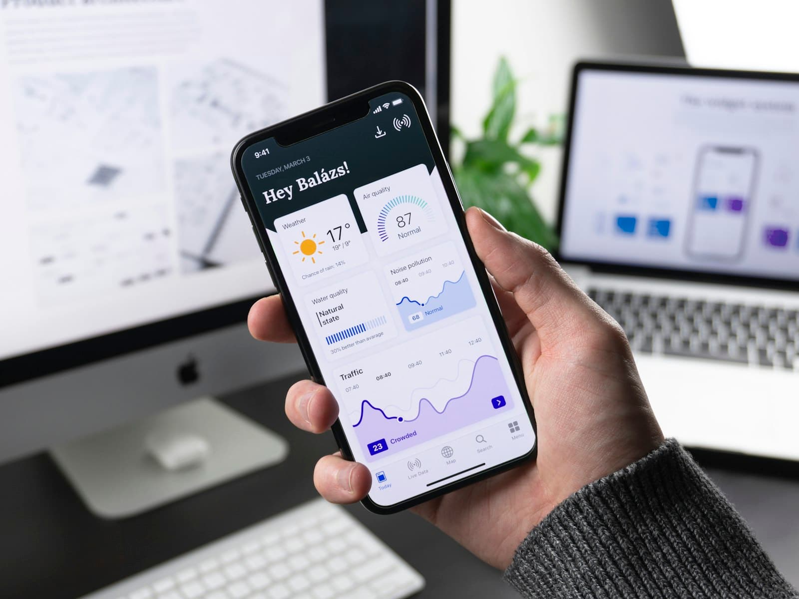
Reviewers recognize a mobile website on sight. Sidebars, hamburger menus, top navigation bars with link rows, and multi-column footers all signal "website wrapper" before a single feature is checked. Native features will not save a submission that still looks like your desktop site shrunk down. Fix the shell first.
The structure reviewers expect is a top bar, a scrollable content area, and a bottom navigation bar with three to five icons. The header and footer stay put while the content scrolls, but not because they are position: fixed. That approach is unreliable in a WebView. Instead they sit as non-scrolling flex children inside one root frame that is itself fixed to the viewport, with only the content area allowed to scroll. The two safe-area spacer divs handle the notch and home indicator, so the header and footer never need to think about insets:
<body>
  <div class="app-root">
    <div class="safe-area-top"></div>

    <header class="app-header">
      <!-- Stays in place, CSS relative (flex child), not position: fixed -->
    </header>

    <main class="app-content">
      <!-- Scrollable content, the only element that scrolls -->
    </main>

    <footer class="app-footer">
      <!-- Stays in place, CSS relative (flex child), not position: fixed -->
    </footer>

    <div class="safe-area-bottom"></div>
  </div>
</body>
The root frame owns the viewport with position: fixed, not height: 100vh. Mobile browser chrome resizes 100vh as it shows and hides, which makes content jump and overflow. The header and footer hold their size, the content area is the only thing that scrolls, and the two spacer divs absorb the device insets:
html, body {
  margin: 0;
  height: 100%;
  overflow: hidden; /* the body never scrolls, only .app-content does */
}

/* Root frame, establishes viewport boundaries */
.app-root {
  position: fixed;
  top: 0;
  left: 0;
  right: 0;
  bottom: 0;
  display: flex;
  flex-direction: column;
  overflow: hidden;
}

/* Safe area frames, handle device boundaries */
.safe-area-top {
  flex-shrink: 0;
  height: var(--safe-area-top, env(safe-area-inset-top, 0));
}

.safe-area-bottom {
  flex-shrink: 0;
  height: var(--safe-area-bottom, env(safe-area-inset-bottom, 0));
}

/* Header, stays in place as a flex child (relative, not fixed) */
.app-header {
  flex-shrink: 0;
  padding: 1rem;
}

/* Content frame, scrollable container */
.app-content {
  flex: 1;
  overflow-y: auto;
  overflow-x: hidden;
  -webkit-overflow-scrolling: touch;
  overscroll-behavior: contain;
  padding: 1rem;
  scrollbar-width: none; /* hide scrollbar so it reads as native */
  -ms-overflow-style: none;
}

.app-content::-webkit-scrollbar {
  display: none;
}

/* Footer, stays in place as a flex child (relative, not fixed) */
.app-footer {
  flex-shrink: 0;
  padding: 1rem;
}
One meta tag is doing load-bearing work here. Without viewport-fit=cover, the safe-area variables resolve to zero and the spacer divs collapse, so the tag is not optional:
<meta name="viewport"
  content="width=device-width, initial-scale=1.0, viewport-fit=cover, user-scalable=no">
Bottom navigation replaces your web menu. Keep it to three to five items, highlight the active tab, and use consistent icons. Make every tap target at least 44px (2.75rem) square, since undersized icon buttons are a common usability flag. Remove the sidebar, the hamburger, the desktop footer, and any cookie banner, which you can hide in native with the isDespia check. The litmus test reviewers apply, and you should too: screenshot the app and ask whether it looks like Instagram or like a website.
How the safe-area variables work
The runtime injects four CSS variables for device insets: --safe-area-top, --safe-area-bottom, --safe-area-left, --safe-area-right. The spacer divs above consume the top and bottom directly. Anywhere else you need an inset, pair the runtime variable with the native env() value as a fallback, so the layout is correct both in web preview and inside the runtime:
.element {
  /* Despia variable, then native env(), then zero */
  padding-top: var(--safe-area-top, env(safe-area-inset-top, 0));
}
The var() value wins inside the runtime, env() covers WebKit web preview, and the 0 keeps the rule valid on desktop where neither resolves. Skip this and your header renders under the status bar while the bottom nav hides behind the home indicator on modern iPhones. Reviewers see that immediately, and it reads as a broken web page.
The small touches that read as native
A few details separate an app that feels native from a web page in a frame, and reviewers notice the difference even when they cannot name it. Some you get for free: the runtime prevents input zoom-on-focus and disables text selection across the UI, and the fixed frame above adapts to the on-screen keyboard without extra code. The rest you opt into.
Because text selection is off by default, mark the places where a user genuinely needs to select and copy, like article bodies or code, with selectable="true":
<p selectable="true">This paragraph can be selected and copied.</p>
Give buttons immediate touch feedback instead of the delayed hover states a web app ships with, stop the body from rubber-banding on overscroll, and use rem units so spacing scales with the system text size:
.button:active { opacity: 0.7; } /* instant press feedback */
body { overscroll-behavior-y: none; } /* no pull-to-refresh bounce */
One pattern is worth singling out because reviewers clock it instantly: native apps present secondary content in drawers and bottom sheets that slide up from the edge, not in centered popups that dim the page behind them. A centered modal is a web convention, and an app full of them reads as a website. Swapping your dialogs for bottom sheets is one of the cheapest ways to shift the feel. If you do not want to build the drag, snap points, and momentum by hand, Cupertino Pane is a small framework-agnostic library (around 12kb, no dependencies) that produces iOS-style sheets out of the box.
None of these is a 4.2 blocker on its own, but together they remove the small tells that make a reviewer reach for the "this is a website" verdict.
Add the native features that clear 4.2
You do not need all of these. Two or three real ones, on top of a proper mobile layout, is the difference between a rejection and an approval. Each is a single call.
Push notifications are the strongest signal, because a website cannot reliably send them on iOS. The runtime registers the device with OneSignal automatically on launch, so you only link that device to your user, on every authenticated load:
if (isDespia) {
  despia(`setonesignalplayerid://?user_id=${userId}`)
}
You can check whether the user has push enabled and route them to settings if not:
const result = await despia('checkNativePushPermissions://', ['nativePushEnabled'])
if (!result.nativePushEnabled) despia('settingsapp://')
Haptics make interactions feel native. Five patterns map to the standard interaction types, called directly at the site of the action:
if (isDespia) despia('successhaptic://') // on a completed action
if (isDespia) despia('errorhaptic://')   // on a failed one
Biometric-locked storage protects a session token behind Face ID or Touch ID. Writing with locked=true means reading the value prompts for biometrics:
await despia('setvault://?key=sessionToken&value=abc123&locked=true')
const token = await despia('readvault://?key=sessionToken', ['sessionToken'])
The native share sheet replaces a web share button:
despia(`shareapp://message?=${encodeURIComponent('Check this out')}&url=https://myapp.com`)
Offline support stops the app from showing a blank screen with no signal. Install the bundler, generate the manifest for your framework, and the runtime caches the asset graph on-device and serves it from localhost:
npm install --save-dev @despia/local
In-app purchases, the rejection that catches paid apps
If your app sells subscriptions or digital content, Apple's Guideline 3.1.1 requires In-App Purchase. Routing digital-goods payments through your web Stripe checkout inside the WebView is a hard rejection. Physical goods and real-world services are fine through the web, this is specifically about digital content unlocked in the app.
Despia bridges native App Store and Google Play billing through RevenueCat, so you trigger purchases and check entitlements from your web layer with no native billing SDK to configure. Launch the native paywall:
if (isDespia) {
  despia(`revenuecat://launchPaywall?external_id=${userId}&offering=default`)
}
Check entitlements on load and after every purchase. getpurchasehistory:// queries the native store directly, so no backend is needed for the gate:
async function checkEntitlements() {
  const data   = await despia('getpurchasehistory://', ['restoredData'])
  const active = (data.restoredData ?? []).filter(p => p.isActive)

  if (active.some(p => p.entitlementId === 'premium')) unlockPremium()
}

checkEntitlements()
window.onRevenueCatPurchase = checkEntitlements // re-check after a purchase completes
RevenueCat has to be compiled into the binary, so enable it in the Despia editor under App, Settings, Integrations, RevenueCat, paste your iOS and Android public SDK keys, and rebuild. Toggling it on without a rebuild leaves it inactive and purchases fail silently.
There is one carve-out worth knowing. Following Epic v. Apple, US App Store users can be linked out to external web payment for digital goods. No other App Store region qualifies, and Google Play does not share the carve-out. The gate is the conjunction of three checks, runtime, iOS, and US store country, which the runtime exposes through despia.storeLocation:
const storeLocation  = isDespia ? despia.storeLocation : null
const allowsWebPay   = isDespiaIOS && storeLocation === 'US'

// Everything else routes to IAP
function CheckoutButton() {
  return allowsWebPay
    ? <button onClick={handleStripe}>Checkout with Stripe</button>
    : <button onClick={handleIAP}>Subscribe</button>
}
Showing external web payment to non-US iOS users or to any Android user gets the build rejected. Treat the country list as a flag you flip from a config server, not a hard-coded array, so you can update it without shipping a new build.
Sign in with Apple, if you offer social login
Apple's Guideline 4.8 is explicit: any app offering third-party login like Google or Facebook on iOS must also offer Sign in with Apple. There are no exceptions. Email and password, magic links, and SMS do not trigger the requirement, only third-party social login does.
Native apps cannot run OAuth redirects the way a browser does, and Google and Apple block OAuth inside embedded WebViews. Despia handles this with two URL protocols: oauth://?url= opens the platform's secure browser session, ASWebAuthenticationSession on iOS and Chrome Custom Tabs on Android, and a deeplink with the oauth/ prefix closes that session and hands tokens back to your WebView. Google uses this bridge on both platforms:
const { url } = await fetch('/api/auth/google-url', {
  method: 'POST',
  headers: { 'Content-Type': 'application/json' },
  body: JSON.stringify({ deeplink_scheme: 'myapp' }), // Despia > Publish > Deeplink
}).then(r => r.json())

despia(`oauth://?url=${encodeURIComponent(url)}`)
Apple Sign In on iOS is the exception that needs no bridge: the Apple JS SDK with usePopup: true opens the native Face ID sheet directly inside the WebView. On Android it falls back to the same oauth:// flow. Keep the Apple button as prominent as the others, hiding it behind a "more options" link is itself a rejection reason.
The piece people forget: native-callback.html
The oauth:// call opens the browser session, but something has to receive the tokens inside that session and fire the deeplink that closes it. That something is a bridge page at public/native-callback.html. Skip it and the user authenticates, then sits on a blank screen in a browser tab that never closes. This is the single most common reason a Despia OAuth flow looks broken.
Use a plain HTML file, not a React or Vue component. A framework router can strip the #access_token hash fragment on route change, so the token disappears before your code reads it. A static file in public/ bypasses the router entirely, and the .html is never visible because the secure browser hides the URL bar. Here is the full template for the fragment flow:
<!-- public/native-callback.html -->
<!DOCTYPE html>
<html lang="en">
<head>
  <meta charset="UTF-8" />
  <meta name="viewport" content="width=device-width, initial-scale=1.0" />
  <title>Completing sign in...</title>
</head>
<body>
  <p>Completing sign in...</p>
  <script>
    (function () {
      var params = new URLSearchParams(window.location.search)
      var scheme = params.get('deeplink_scheme')
      if (!scheme) { console.error('no deeplink_scheme'); return; }

      // Tokens arrive in the hash on the implicit/fragment flow
      var hash         = new URLSearchParams(window.location.hash.substring(1))
      var accessToken  = hash.get('access_token')
      var refreshToken = hash.get('refresh_token') || ''
      var error        = hash.get('error') || params.get('error')

      if (!accessToken) {
        window.location.href = scheme + '://oauth/auth?error=' + encodeURIComponent(error || 'no_access_token')
        return
      }

      // The oauth/ prefix is what tells Despia to close the browser
      // session and navigate the WebView to /auth with the tokens
      window.location.href =
        scheme + '://oauth/auth' +
        '?access_token='  + encodeURIComponent(accessToken) +
        '&refresh_token=' + encodeURIComponent(refreshToken)
    })()
  </script>
</body>
</html>
Two things make or break this page. The deeplink_scheme has to be passed through to it, usually as a query param on the redirect URL you generate, so the page knows which scheme to fire. And the deeplink must keep the oauth/ prefix: myapp://oauth/auth closes the session and routes to /auth, while myapp://auth without it does nothing and the user stays stuck. Your /auth page then reads the tokens from the URL and creates the session. If /auth is already the mounted route when the deeplink lands, make the token handler react to URL changes, not just to mount, or it fires once with empty params and never again.
Tell the reviewer what you built
The reviewer notes field is where you preempt a 4.2 rejection. List the native features you implemented, state how the app differs from your website, and give working demo credentials if there is a login wall. A reviewer who cannot get past your login screen rejects the app, and a vague description makes them assume the worst. A note like "uses native push via OneSignal, Face ID through the storage vault, haptics on all interactions, and offline support, with bottom-tab navigation" does real work.
While you are at it, clear the quieter rejections that have nothing to do with the conversion: let users delete their account from inside the app if they can create one, make sure your screenshots show the app rather than a splash screen, and confirm prices in metadata match the app.
One codebase is the reason this is worth doing
The trap people fall into after a 4.2 rejection is assuming the only real fix is a full native rebuild. It is not. A rebuild gives you a second codebase to maintain forever, in a language your team may not write, for an app that is mostly the same screens you already shipped on the web.
Keeping one codebase is the point. Your web app stays the source of truth, the native features extend it, and content updates ship over the air through remote hydration without an App Store resubmission. Only native configuration changes trigger a new build. When you do need to drop to native UI or a native package for one screen, you can, inside the same web codebase, and a full Xcode or Android Studio project exports at any time if you ever want to leave.
Get it on the stores
Take the website you already have, fix the shell, add the two or three native features that clear Guideline 4.2, and ship it to iOS and Android without a CLI or a Mac. Code signing and submission run from the browser, and you keep one codebase the whole way.
See the setup docs at setup.despia.com or start building at despia.com.